.png)
Design 101 - How to Create a Timeless Interior (That's NOT Boring)
- Oct 10, 2023
- 12 min read
Updated: Oct 11, 2023
Sooooooo. You've heard the phrase "timeless interiors" and you're doing a little research. Smart move babes! Timeless is where it's at and I'll tell you why in a minute. But you've been Googling the heck out of that phrase aaand...
...le sigh.
You find a mind numbing parade of similar, bland, contemporary rooms.


The advice out there is all...neutral palette, clean lines, white linens, subtle patterns, less is more, less is more, beige, greige, White, WHIte, WHIIIITTTEEEE! And all you can think is that sounds like your own personal brand of boring, vanilla hell?! Whew! Me too darlin'. Me. Too.
Not that I have a problem with any of those things individually, but taken all together and without some serious design guidance you can end up with, well, the results above. The most maddening part is you can get some design guidance and still end up with the results above (looking at YOU big-box e-design websites). Not to worry though. I'm here to help you discover true timelessness which is the opposite of blah!
First things first. If timeless isn't those things, what is it, and why should I want it?
Truly timeless interiors can't be dated because they don't cling to a single era or trend or look. It's not about wiping out everything that stands out in a space and hoping that makes it last. Actual timeless interiors are complex, unique and look as good when they are designed as they do decades later, because if they were never "in" they can never go "out". That's why all those contemporary living rooms above will never be timeless. In spite of all the neutral colors and "clean" lines, they represent a very particular look that has become popular in the last decade but will eventually fade with time. Let's see some examples, then, of how to do it right. Take a look at the room below which is one of my favorite examples of timelessness.

This room could easily have graced the pages of Traditional Home or Southern Living magazines a week ago, so would you be surprised to know that this was designed by Albert Hadley (an iconic Interior Designer) in 1962? Hadley designed this space for tastemaker Nancy Pyne who wanted something vastly different from what everyone else was doing at the time.
Curious what most living rooms looked like in 1962? Here's a page from Better Homes and Gardens magazine that year.

Saturated colors, Scandinavian furniture and geometric prints were the height of fashion. But it didn't take long before interiors started to veer towards the softer colors, plusher furnishings, and frilly fabrics of the 80's, leaving the look above feeling old and dated. And while everyone else was stripping their homes of one trend and switching it up for the next, Nancy Pyne was sitting pretty in a home she still loved and that still felt relevant. In fact Pyne had those same sofas and chairs, upholstered in the same fabric, until the 2000's. Girl must have been an absolute queen at upholstery cleaning!
So WHY timeless design? That's a no-brainer! Because YOU want to be sitting pretty in a home that YOU still love and that still feels relevant decades down the road! Let all the other copycats make themselves crazy chasing the trends. You're smarter than that! Consider the impact to your wallet, the landfill, and frankly your sanity if you purchase a few really great pieces that last 50 years, versus a bunch that need to be replaced every time a trend dies. The time, money and resource savings have been known to save a marriage or two. It's also a really stellar option for vampires that are sick of the redecorating and just wanna exist in peace. I feel that.
Now here's my favorite part of the Hadley/Pyne story. They used a floral chintz fabric they both fell in love with even though chintz was out of fashion at the time. Pyne's family and friends told her not to use it but she ignored them. Skip ahead to 2008 when she was downsizing to a retirement home and Schumacher Fabrics approached her to re-release the now iconic print. She provided them with some cuttings from the original fabric and the pattern was made available in 2010 as "Pyne Hollyhock" and became sought after all over again. Here it is as it appears on Schumacher's website today.

Doesn't look old, right? Even if it's not your particular taste you can see how the pattern can still be relevant today and appeal in a way that doesn't speak to trends. THAT'S timeless.
Below are pictures of Nancy Pyne in the originally designed room in 1962....

...and Pyne in her retirement cottage with freshly upholstered pieces in 2010. Still stunning.

Pyne also hated curtains, rugs, and what she called "clutter", so as you can see in all of these photographs the floors are mostly bare, the curtains are very plain, and there are only very minimal decor items. This was one woman that knew what she loved, was not afraid to forge her own path, and kicked all the doubters to the curb.
Here's another favorite timeless design of mine. Below is an image of Yves Saint Laurent's Paris salon photographed in 1976...

...and the same salon photographed in 2009 after it was redecorated to house his art collection.

As you can see the majority of the furnishings and decor items remained the same including the sofa, chairs, stools and some of the side tables. The flooring, wood paneling and lighting remained as well. The patterned rug and pillows were removed so as not to compete with the art, but very little needed to be done to this incredibly chic room. Anyone else craving a martini now? It's 5 o'clock somewhere...probably in Paris.
And one more just for the heck of it. Below is a photograph of Ralph Lauren's Round Hill Cottage in Jamaica as photographed for House and Garden magazine in 1984.

And here is the same room in 2007 as photographed for Architectural Digest.

Well THAT aged well. Not a lot changed aside from adding a little more color. I don't know about you but I would be living on that custom Donghia chaise below the bookcase.

Yeah. That one.
Now what other qualities does a timeless design have and what should you keep in mind?
MOST IMPORTANTLY...seriously, tattoo this on your brain...timeless design fits where and for whom it is designed. The needs of each home and it's inhabitants are a unique combination. If you design for place and people every design will be inherently unique. The closer a design is matched to the place and people, the longer that design will last. When you satisfy your wants and needs with personalized design, the desire to follow trends and seek constant change is eliminated. You don't have to keep looking for the next best thing, because you already have the best thing FOR YOU.
So how do you do it? How do you make sure your design fulfills your wants and needs?
Firstly, don't try to copy what you see somewhere else. I know this can be hard, I get it. We're constantly manipulated with marketing messages because companies and influencers WANT us to copy what we see. Why? Because it lines their pockets honey, but it empties yours! It's ok to use images of other rooms for inspiration....I do it all the time! But try to break down what it is that you really like about the design. Is it the overall mood? A great layout? Is it a particular piece? Is it the use of color or pattern or lighting? Make a list and use those things as guidelines for your design. Adapt them to YOU, not the other way around!
Next, focus on function and comfort. A room that's not functional or comfortable isn't going to last very long. You'll be changing things up in a year or two, tops. Consider how YOU need to use each room. What items do you need for those uses? Don't feel constrained by what the room is supposed to be, only by what you need it to be. Figure out your layout first and plan for plenty of storage. Then add things that make it comfortable and special for YOU like directed lighting, tactile upholstery, useful items at hand, sentimental pieces, that vase shaped like a monkey holding a lotus that you got in a little boutique shop back in your 30's that still makes you smile every time you see it...........
.....ahem.
A great example of this is the dining room below designed by Sasha Adler for a family in Chicago.

What is the "typical" layout in a dining room? Centering the table on the room and adding a couple of storage or serving pieces around the perimeter, right? That's what's expected, but that wouldn't have served the needs of this particular family. They also wanted a place to have a drink and to listen to music at the end of the day. So Adler chose to place the dining table against one wall with a long banquette, and add a wet bar, complete with lounge seating and a record player, on the opposite wall. Adler planned for function, and thought about the little comforts the family needed to make this space perfect for them. She was even able to repurpose the wife's favorite Platner chairs with the original orange mohair upholstery from her 1970's childhood home.
Which brings me to my next bit of advice which is have your room tell a story about YOU using things you love. If you don't know where to start, write a short bio about yourself! What bio would I write for the owners of the dining room above? I picture them as a down to earth and preferring informal entertaining. They appreciate music and the arts, and value pieces that are solid and comfortable as well as items with sentimental value. They don't like fussiness but need a little drama thrown in here and there to keep things interesting. What do you think? Sound likely based on the room's design? Once you identify your basic preferences and personality in your bio it can help guide you as you make choices for your space. So be honest, get personal and for sure mention your penchant for ceramic monkey vases.
Great, so now you know how to approach timeless, enduring design, but how do you make it not boring?
Contrast and novelty are everything! If you want to fall down a bit of the same rabbit hole I did, here is a link to an article from the New York Times' The Cut about the human brain's need for variety and complexity in our built environments. For the rest of you who can stay on task (unlike me obviously), here's a synopsis. There are negative physical and psychological effects to environments we find "bland, monotonous and passionless" (think cubicles in an office or the long blank facade of a warehouse type building). The negative effects manifest in the form of low levels of brain activity (psychological boredom), and higher heart rate and cortisol levels (physical stress). It's kind of alarming actually, that boring environments aren't simply neutral but are actively causing us stress! That's the LAST thing you want your home to do.
Consider the following images:


Which room has more visual complexity and variety? Obviously the second. So which is better for your psychological and physical health? Yep, you guessed it! I know I made that incredibly obvious for you, but seriously...this ain't brain surgery darlin'. But it will still affect your brain.
Okay, variety and complexity. Sure, sounds reasonable but what does that mean practically speaking? Here's a list of elements you can manipulate when executing your design.
1. Use contrast.
High and low, modern and traditional, old and new. The more varied your space, the less likely your room can be pinned to any one era, and the less boring and more timeless it becomes. Designer Angie Hranowsky excels at this as evidenced in the room she designed below. Here she used furnishings and decor from a range of time periods, styles and price points. That along with her on-point use of color banishes the boring and makes this room impossible to date.

2. Add or capitalize on architectural details.
If your room has architecture, great, highlight it! If not, consider adding some in the form of moldings and trims, built-ins or wall and ceiling details. A plain white box is like that warehouse facade...gut wrenchingly soulless and devoid of all human emotion. (Dramatic? Me? Never! I'm trying to heal your physical and psychological wounds here people.) Architectural detail adds a layer of complexity and visual depth to your design. Remember, though, while you can let the architecture contribute to your overall design, don't be a slave to it. That's just creating a time capsule...not something timeless. Consider this room by Jean-Louis Deniot that uses its classical architecture as a foil to the more modern elements in the room.

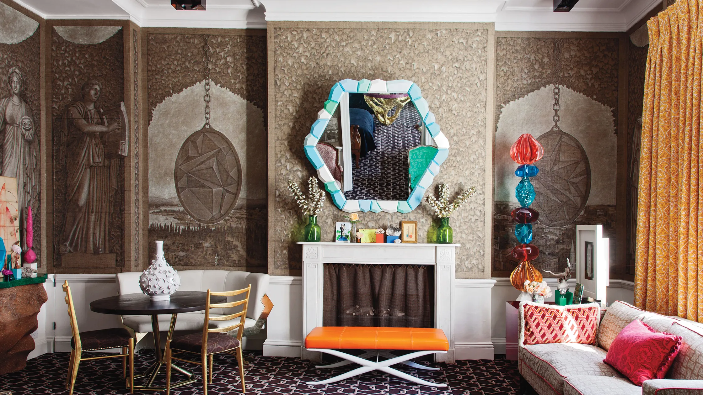
3. Use one-of-a-kind or statement making pieces.
You know what's THE OPPOSITE of boring? Something you've never seen before! Adding interest and variety can be as easy as hanging some original art or using an antique or unique item in your room. One of the modern masters of using statement pieces is designer Martyn Lawrence Bullard. Here is a room in the Beverly Hills home he designed for RuPaul featuring a number of disco balls hanging from the ceiling, and walls plastered with stunning photographs of RuPaul in drag. I can guarantee you've never seen something like this before! Be fearless, be bold, do something new. And in the immortal words of RuPaul..."good luck and don't f**k it up".

4. Combine colors in new ways.
One thing that can really date a space faster than any other is color. Remember the avocado green, mustard yellow, and orange of the 60's? The bright neon and golden oak of the 80's? The burgundy, forest green and espresso finish of the 90's and 00's? And don't get me started on the oil-rubbed bronze craze people! When approaching color for your home, don't look at what everyone else is doing if you want it to last. Find a combination that you love but is a little unconventional. To do this, pull color palettes from art, nature or items you want in your room. Take, for example, this unexpected but exquisite combination by Miles Redd. Redd pulled the color palette for this dining room from the artwork, and ended up with this striking design. The benefits of using a color palette this unexpected...no one will ever be able to date this room based on its colors, and your room, and you by extension, will always remain memorable. The downside of using a color palette this unexpected is...just kidding, there are no downsides.

5. Layer patterns and textures.
Pattern and texture to me are intricately linked and essential to interesting design, but this is an area where a lot of people struggle to make it work. If that describes you, my advice is to study some designer spaces, obtain a variety of samples for your room and just play with it. Have a little fun! If you have a couple of small scale prints, throw a large scale one in there to shake it up. Add in stripes, geometrics and organic prints. If you want a cozy space, use soft, fuzzy or wooly fabrics. If you want a luxe feel, add in some shine and sparkle. If you want cool and comfortable, opt for sleek or crisp materials. The only hard and fast rule is mix it up! It's hard to date any space with an interesting mix of pattern and textures as long as they span multiple eras and trends.

Above is a bedroom created by hotelier and designer Kit Kemp who is absolutely fearless at combining pattern and texture, and you can learn a lot from examining her work. See how she uses different sizes of patterns, from the large scale prints on the headboard and sofa, down to the small scale striations on the wallpaper and stitched chevron on the bedskirt? Repeating colors keeps the disparate patterns feeling cohesive and she intersperses bolder patterns with more subdued ones, making this a level of pattern and texture a lot of people could be comfortable with. This is one of her middle-of-the-road designs as far as mixing pattern and texture, but even her more layered designs use the same basic principles. Let's quickly look at one of those.

Kemp designed this space for the Chelsea Harbor showroom of Turnell and Gigon, and I'm swooning. No really, where's the fainting couch? It's a riot of patterns and textures, but it still starts with the same principles as the bedroom above. Keeping a tight rein on the color palette ensures all of the patterns feel cohesive and mixing the scale of the prints gives the eye a resting point in between the bolder moments.
But there are a couple of master-stroke moves she made here that she didn't use in the bedroom above. Take a look at how Kemp used the same print on the wall and dining chairs but in different colorways.

The repeating pattern keeps the dining area from feeling too busy, but the change in color lets the chairs stand out a bit more. But the most brilliant thing she does is with the prints on the headboard and the wall covering in the rear room. Looking across the space those two elements really appear to flow together. Here, let me show you a closer view because this is the good bit.

See how the colors of those two prints are the same as is the scale? They also have the same organic, garden-bouquet feel to them and they both create a stripe effect on a neutral ground. While they are not the same print, they are so closely related visually that they go together like wine and cheese. This is GOAT level pattern mixing people. I can only hope to aspire to this one day.
Alright my darlings, this has been an absolute brain dump of information and I hope it helps guide you when creating your NOT-SO-BORING timeless space...because that's what timeless is really all about after all. And to finish this out and give your tired brains a rest (and mine too), here is an eye candy collection of some of my favorite timeless rooms for inspiration. One of these dates back to the 1930's and some are only a few years old. Try to guess which is which, but you can always hover over each picture to find out. When you're ready, get out there and design a timeless room! And once more for good measure...good luck and don't f**k it up!


Take my Design Style Quiz to discover your personal style!
Subscribe to my site at the top of the page and get notified when new blog posts come out. You'll also get exclusive access to the Designer Tips area of my website that has insider tips not available on my blog.
This blog post may contain affiliate links. After clicking on a link, any purchase, at no additional charge to you, renders me a small percentage and helps to make this blog possible. Thank you.
Let's collaborate! I would love to help you pull a look together for your space. You can read more about what I offer on my Services page.
If you would like to see more Interior Design Inspiration head over to my Portfolio or Shop My Style pages.


Comments